Customize your data analysis by configuring widget metrics in the analytics dashboard to suit your company's unique terminology, use cases, and operational needs. Sort, filter, and visualize data according to the insights you need to make critical decisions in real time.
For example, you can add multiple instances of the same metric to a single dashboard, setting each one to reflect the specific data you want to see. For instance, you can set one Canceled Shipments widget to be grouped by carrier to compare their cancellation rates, and another by the day of the week to understand cancellation patterns based on timing.
Before You Begin
- Add the widgets you want to include to your dashboard. Learn more about setting up analytics dashboards in Delivery Hub.
Edit a Widget
Select Edit, then select the context menu  of the widget you want to configure > Edit. Alternatively, you can edit a new widget directly from the catalog.
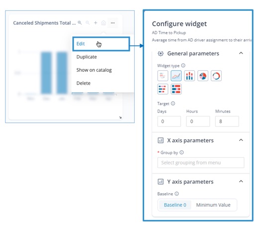
Select Edit to open widget configuration settings
Be sure to select Save to preserve your changes. If you change your mind after making changes, you can select Cancel to discard them.
Change widget title or description
To change the title or description of a widget, hover over the edit  icon, then enter alternate text. This is particularly useful when you have multiple instances of the same widget, such as when you want to track the same data type for different carriers or locations. For example, you can create one Total Shipments Created widget that tracks the number of shipments created by each location, and another that tracks by fulfillment type.
The analytics dashboard preserves the original widget name and description for your reference.
Choose visualization type
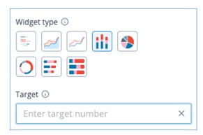
To configure the type of visualization to use to display your data, select a Widget Type.
Select a data visualization method
For example, use a whole number widget if you simply want to show the total number of orders fulfilled. Or use a bar chart to compare the same results according to different dates, locations, carriers, and so on.
Different visualizations offer different types of configuration capabilities. For example, you can set a target when using a whole number, line, or bar chart. However, only in line or bar charts can you configure elements of the X or Y axis.
Evaluate your KPIs relative to a benchmark
For widgets that use line charts, bar charts, and whole numbers, you can enter a numerical value as your target.
Set a target value for your widget
For example, set a benchmark of the amount of orders you want to fulfill per hour, and then check the results against that gaol to evaluate success.
If the widget measures duration, you may be asked to enter the number of days, hours, and minutes as your target.
The target line displays on the chart, so you can easily see how your data compares to your goals.
Group and compare time periods
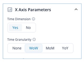
For line and bar charts, you can organize your data according to a time grouping, and choose whether to compare equal buckets of time to another.
Choose a time span for each data point
Step 1 Under Time Dimension, select Yes.
Step 2 (Optional) Select the applicable Time Granularity indicating whether you want to compare your data trends week to week (WoW), month to month (MoM), or year to year (YoY).
For example, view total unique customers grouped by each day within the time period you selected in your filters. Or, compare the amount those totals increased or decreased week by week within the time period.
Group data by locations or shipment types
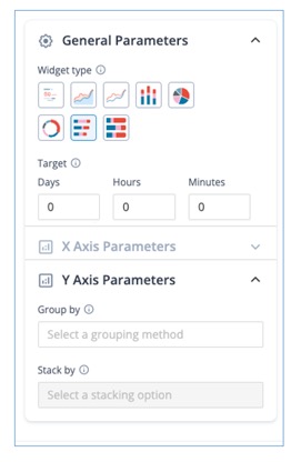
To organize your data by groups, select the dropdown under Group by and select applicable categories.
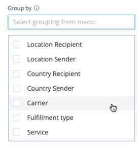
Select a grouping attribute
You can choose multiple groupings for all charts except for pie and donut charts, which can only be grouped by one category, and whole number widgets, which can't be grouped.
For bar charts, you can stack your data using a further grouping. To do so, select from the dropdown list under Stack by.
Define the lower limit of your Y Axis
You can set your baseline as zero or select Minimum Value to always view the lowest value as the lowest number on your y axis, enabling you to see fluctuations in your data more clearly.
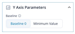
Select the lowest value of your Y axis